

Copper bronze
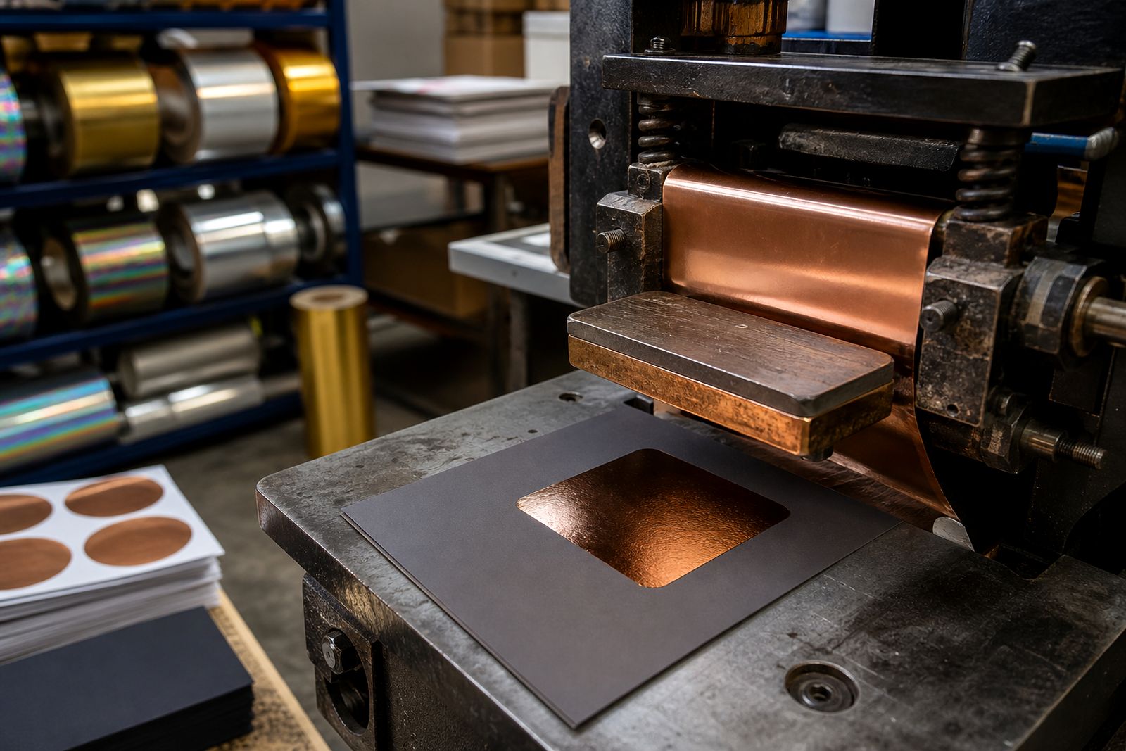
Copper bronze gives a warm metallic look with a grounded, premium feel. It suits labels, cartons, book covers and leather pieces where bronze tones need to read cleanly.
What it looks like
Copper bronze sits between copper and antique bronze, with a warm reflective finish that feels less bright than gold and less cool than silver. On press, it can read richer on dark stock and more muted on natural or textured surfaces.
For a more reflective result, pair it with a smoother board or film and keep the impression even. On textured or soft-touch surfaces, expect a softer read with more visible grain from the stock.
- Good for premium labels and cartons
- Often chosen for spirits branding
- Works well where a warm metallic is needed without a bright gold look
Where it suits
This finish is commonly used on coated board, packaging films, soft-touch laminate and selected leather applications. It can also work on plastics and textiles when the die, pressure and release profile are set correctly for the substrate.
For leather goods and specialist finishing, keep the artwork simple enough to hold detail and avoid very fine reverse spaces unless the stock and die are well prepared. If you need a warmer alternative, compare it with Bright gold and Antique gold.
| Stock | Typical fit |
|---|---|
| Coated board | Clean metallic panels, branding and borders |
| Soft-touch laminate | Warm contrast with careful make-ready |
| Leather | Specialty use with tested pressure and dwell |
| Plastics and textiles | Use only after press-side testing |
Foil choices
Copper bronze is part of the metallic range supplied in slit rolls for trade finishing. If you need a warmer or cooler read, compare it with gold, silver and satin finishes, or use it alongside pigment or specialty foils for layered branding.
Matching the job to the foil family matters. Metallic foils are the natural fit for reflective copper bronze effects, while holographic, diffraction and security foils are better used when the brief calls for movement, pattern or protection.
- Mirror silver for a brighter reflective contrast
- Satin silver for a softer metallic tone
- Matte black pigment or Opaque white for contrast layers
- Rainbow holo and Linear diffraction when the design needs movement
Press checks for copper bronze
For a new copper bronze job, start with press-side testing. Use a sensible temperature window, then adjust dwell, pressure and release profile until the foil transfers cleanly without over-impressing the stock.
As a starting point only, many jobs are tested in a moderate hot stamping range and then tuned to suit the press, die and substrate. Magnesium, copper and brass dies can all behave differently, so make-ready and heat transfer need to be checked before running long.
- Check the foil release on solids and fine detail
- Watch for pinholing on textured or coated stocks
- Test the trim and edge definition on the actual job stock
- Confirm performance on platen, cylinder or roll-to-roll equipment
Getting the copper bronze job ready
Good results start with the artwork, die and stock combination. Keep large solids balanced, allow for the stock finish, and plan the foil width so the roll is slit to the right size for the machine and image area.
If you need samples or swatch books, ask through the contact form. For a broader view of the range, you can also browse the finishes library or go back to the applications hub for more use cases.
- Confirm the substrate before production
- Allow time for press-side adjustment
- Ask for advice on dies, make-ready and temperature windows
- Use foil width that suits the press and layout
What our Hot Stamping Foil customers say
Verified Google reviews
Also worth a look
Ask about a foil for your job
Send a note through our contact form with the substrate, the press you run (platen, cylinder or roll-to-roll), the finish you are after and the run length, and we will come back with a foil grade, a sample and a quote.
Open the contact form