A finish-first view of the catalogue for designers and print buyers.

High-brightness gold with clean edges on coated board.
Swatch notes →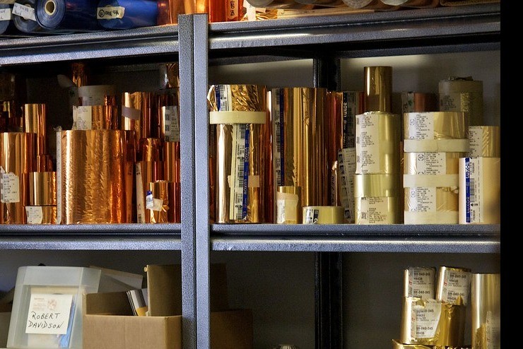
Softer gold with warmer undertones for heritage brands.
Swatch notes →
Near-chrome silver for tech and cosmetics.
Swatch notes →
Lower glare silver for editorial covers.
Swatch notes →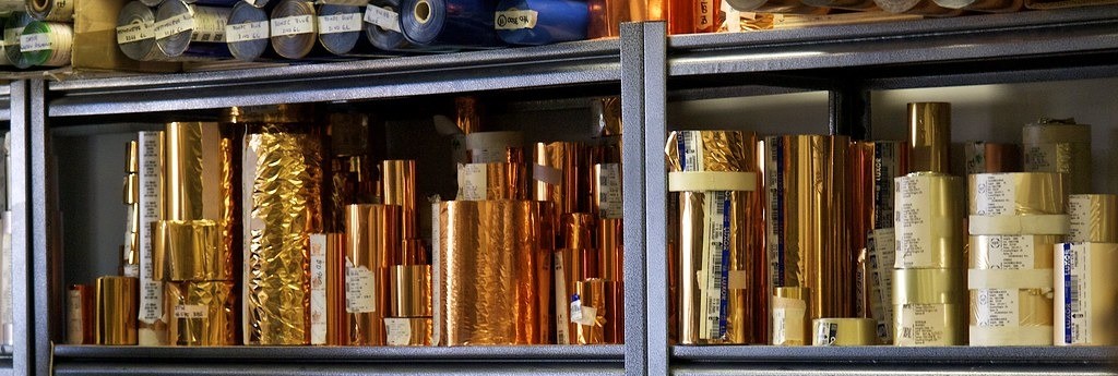
Warm metallic for spirits and leather.
Swatch notes →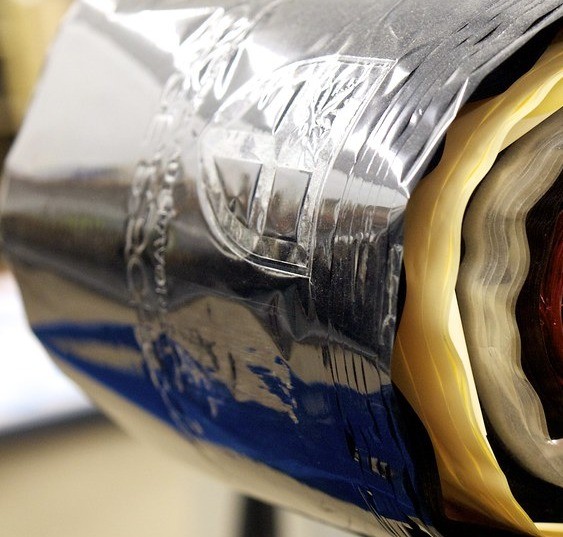
Deep opaque black on light stocks.
Swatch notes →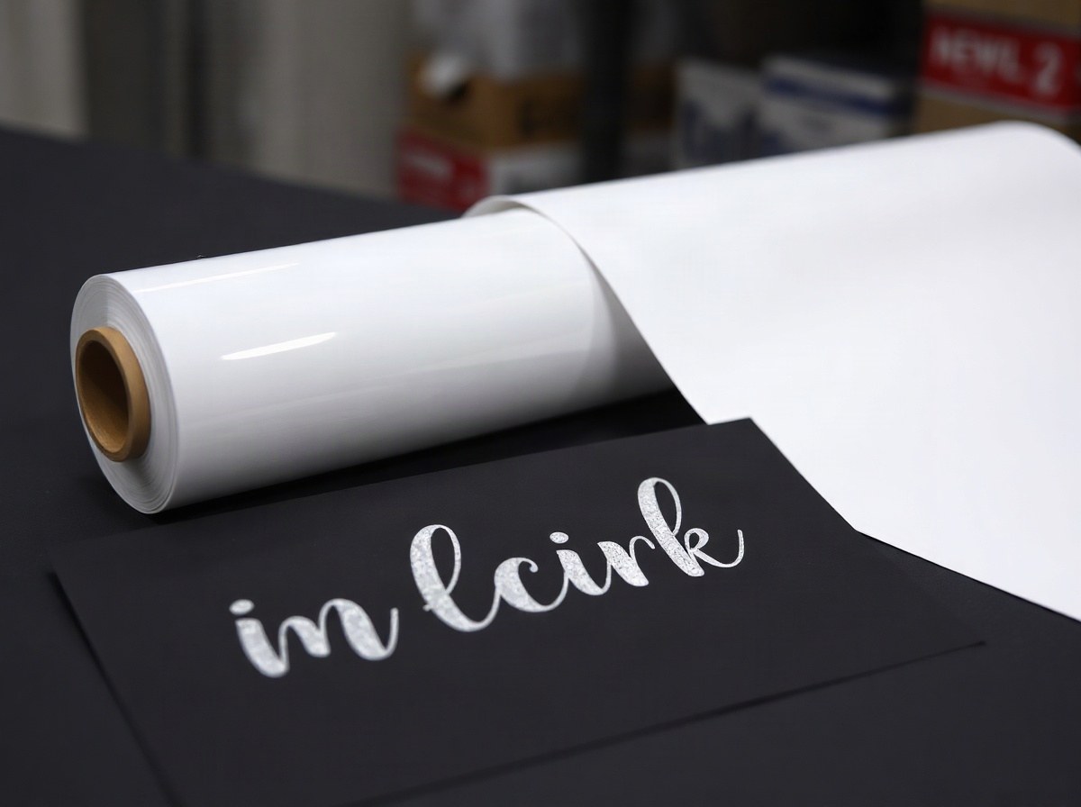
White pigment that covers dark boards.
Swatch notes →
Bold opaque red for retail labels.
Swatch notes →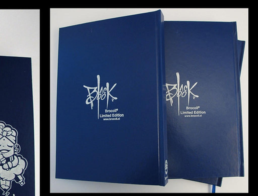
Cool opaque blue for corporate suites.
Swatch notes →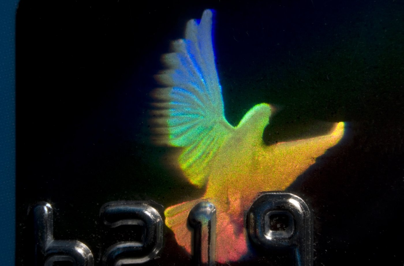
Full-spectrum diffraction sparkle.
Swatch notes →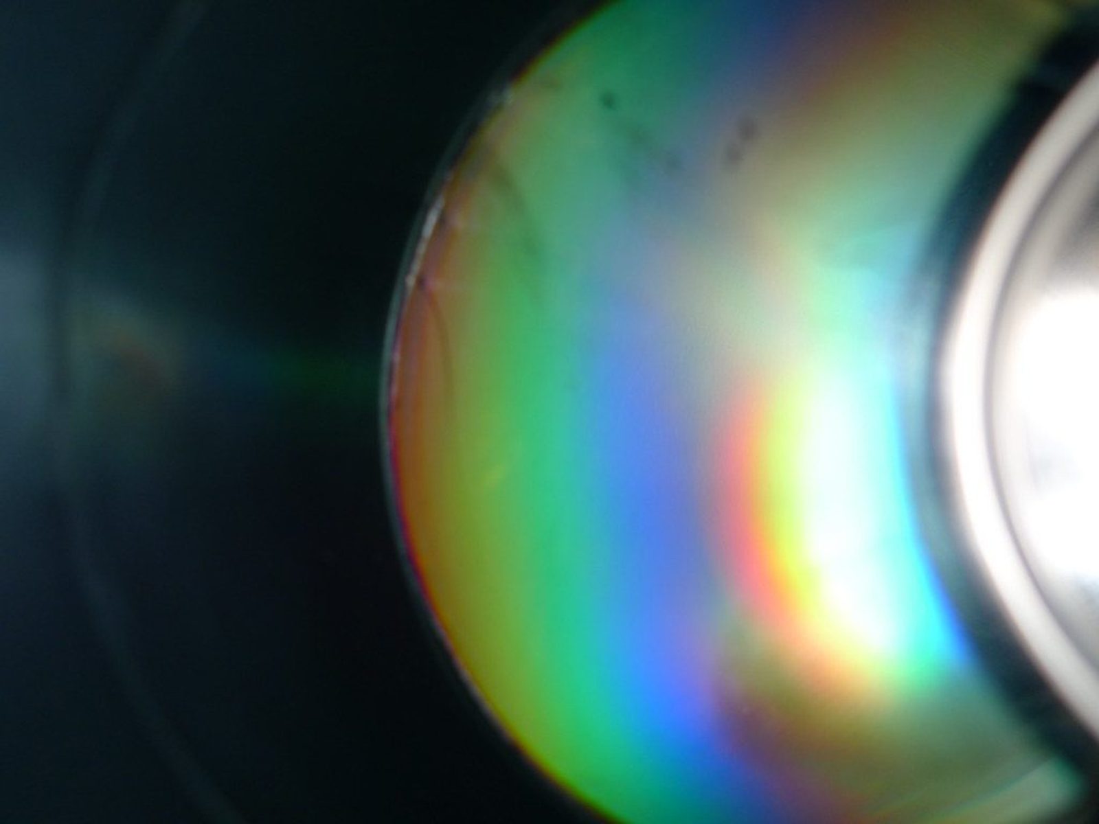
Directional beam patterns.
Swatch notes →
Gold over soft-touch laminate friendly grades.
Swatch notes →Bright gold is not antique gold. Mirror silver is not satin silver. Rainbow holo is not linear diffraction. Designers who speak finish language get cleaner proofs and fewer awkward PDF ping-pong rounds with the printer.
This library maps the look you want to grades we can actually supply into South African presses. Pair a finish page with the matching product family, then confirm release and heat on the stock you intend to run. Soft-touch laminate, UV varnish and dark boards all change which grade behaves.
Brand teams in Sandton and Stellenbosch often start with a Pantone intent and a photo of a competitor pack. We translate that into bright vs antique, chrome vs satin, pigment vs metallic, and whether diffraction helps or distracts. Agencies get a short spec note their converter can run without guessing.
Trade printers still ask for side-by-side drawdowns when two golds look identical on screen. Bring the board to the Johannesburg counter or mail a cut sample. See colour matching for Inkline Process jobs and holographic without the gimmick when youth packaging briefs get loud.
Finish choice also drives roll width and indent timing. Common bright gold and mirror silver sit on the Jet Park shelf; odd pigment and security pitches indent with batch control. Talk to finishes@stampingfoil.co.za before you promise a launch date that the foil cannot meet.
Opaque white and process colours earn their keep on dark boards where metallics would muddy the brand palette. Matte black pigment is a quiet workhorse for editorial covers. Soft-touch gold is a specialty lane: the grade has to bite without tearing the soft layer, and not every bright gold will.
Keep a physical swatch in the creative deck. Screens lie about sparkle and about how linear diffraction reads at arm's length. When in doubt, walk the Johannesburg counter before the agency locks the key visual.
Linear diffraction and rainbow holo are easy to confuse in a Zoom call. One is directional; the other sparkles every way. Put both chips under the same light before you pick. Your security brief and your youth brief will not want the same answer.
Antique gold and copper bronze share warmth but not the same undertone on kraft. Always proof on the real board. Champagne lighting in a studio will flatter both and hide the difference your buyer will see in daylight.
