Where converters and brand finishers put our foils to work.
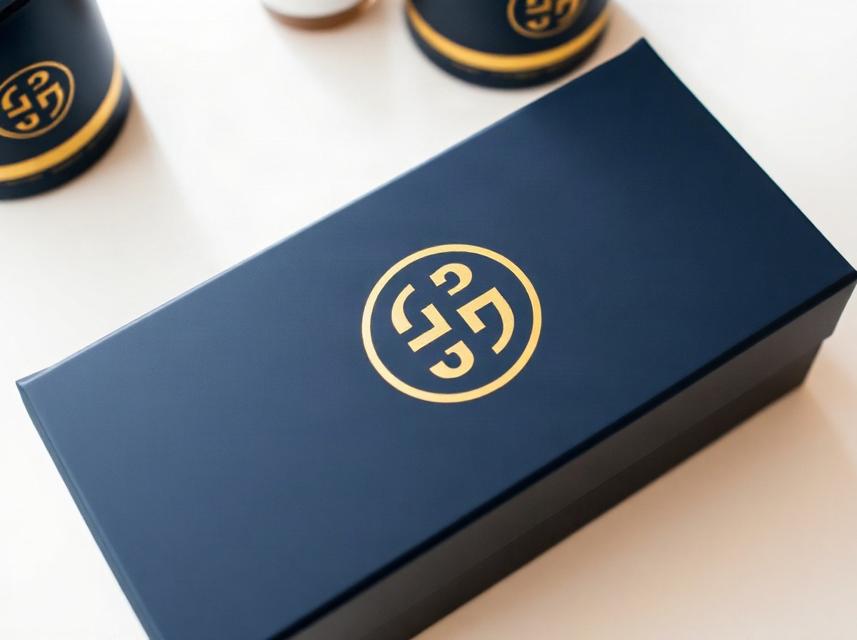
Folding cartons, rigid boxes and gift sleeves that need a premium foil hit.
View →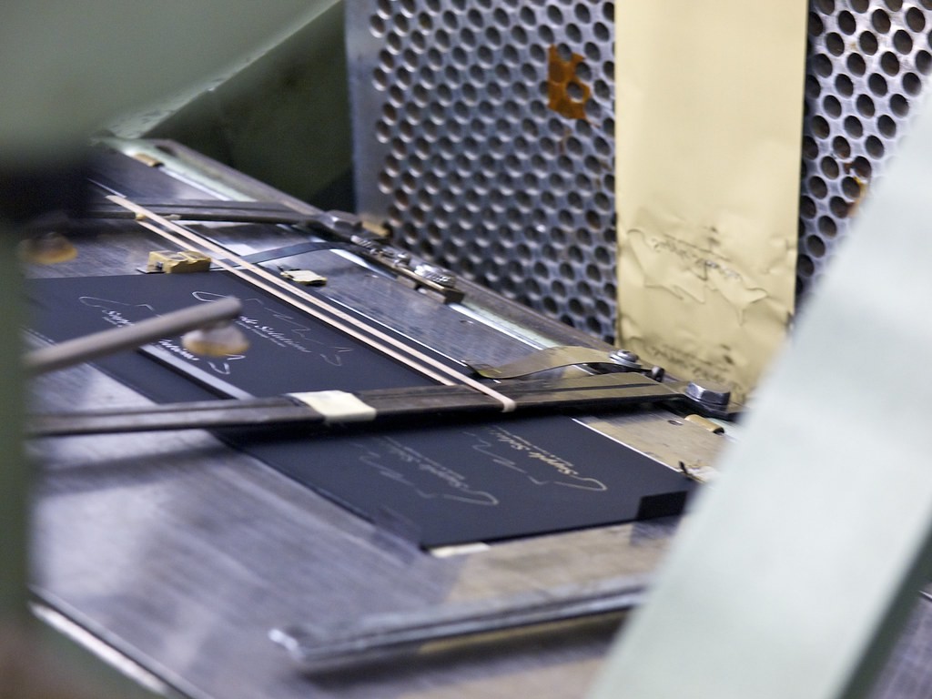
Pressure-sensitive labels, seals and decorative stickers.
View →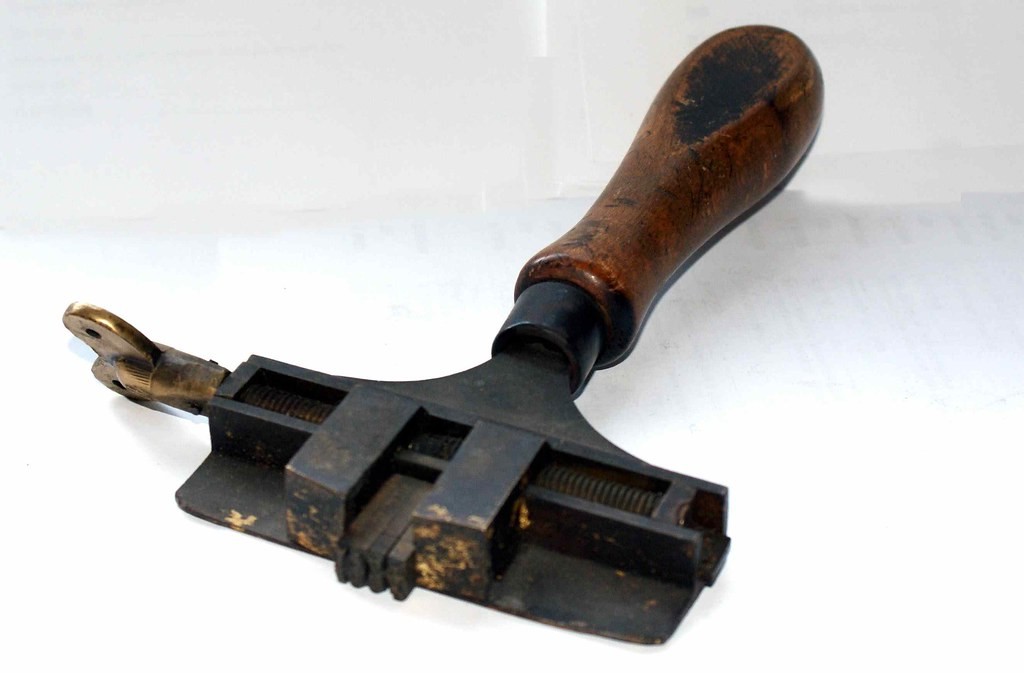
Branding on wallets, bags, belts and footwear components.
View →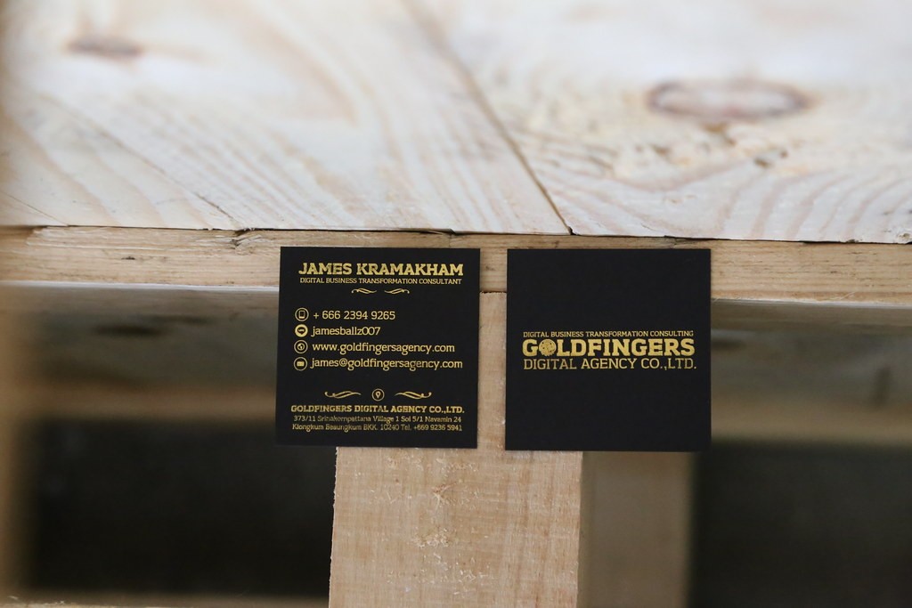
Edge-to-edge and spot foil on heavy card stocks.
View →
Cloth and paper covers with metallic titles and ornaments.
View →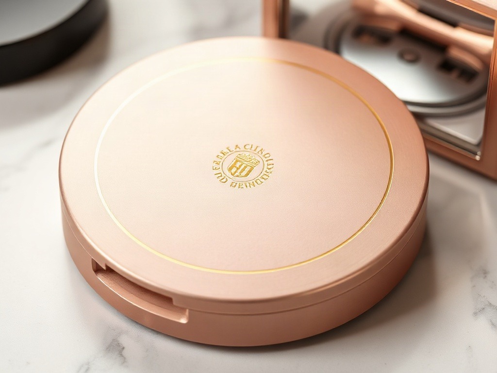
High-gloss and soft-touch cartons for beauty brands.
View →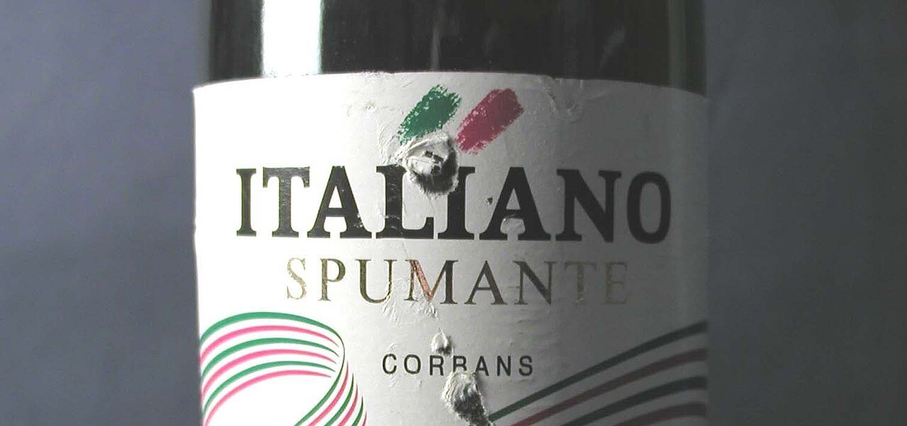
Neck labels, cartons and wooden box branding.
View →
Security-leaning foils for diplomas and plaques.
View →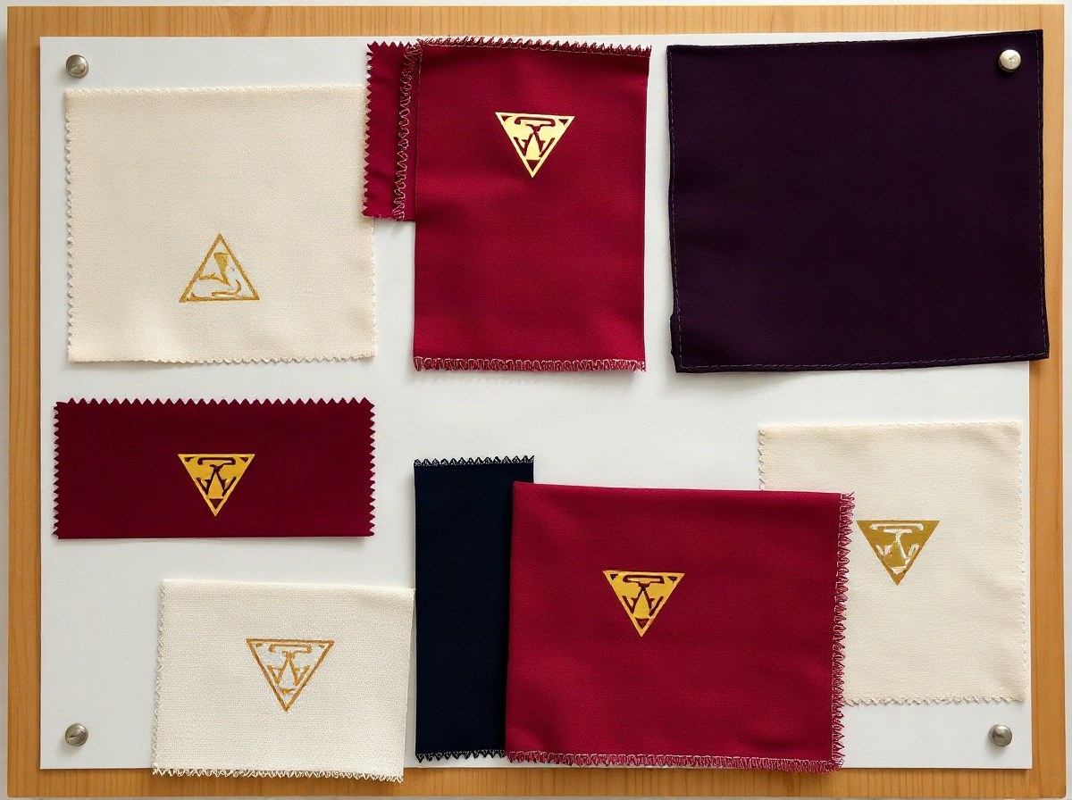
Heat-transfer friendly foils for soft goods.
View →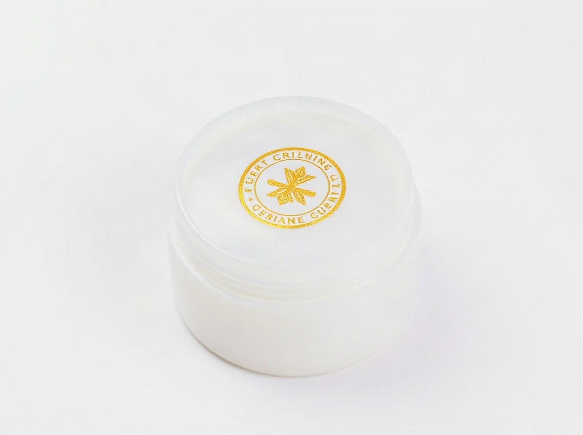
Durable marks on closures, panels and consumer goods.
View →
Holographic and microtext options for seals.
View →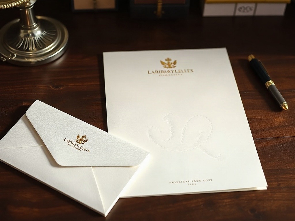
Letterheads, folders and invitation suites.
View →Packaging converters chase gold and silver that survive soft-touch and UV stack. Label houses want narrow-web rolls with clean release on PS stocks. Leather workshops need softer heat so grain does not crush. Book cover finishers still ask for antique gold that reads warm under gallery light.
Cosmetics cartons often mix chrome mirror with a pigment hit for seasonal colour. Wine and spirits jobs lean bronze and copper on shaped neck labels. Security printers ask for diffraction and microtext with controlled supply, not open-bin holo glitter. Stationery suites still want satin silver logos that do not scream from across a boardroom table.
If your brief sits between two of these, say so early. Hybrid jobs need a trial roll more than a clever product name. Start with the relevant application page, then cross-check finishes and the substrate chart so the grade matches the board you actually bought this month.
Across South Africa the mix shifts by corridor: Stellenbosch and Paarl push wine cartons and neck labels; Midrand and Isando lean pharma seals and appliance badges; Durban textile finishers ask about flexible carriers. Jet Park holds the metallic staples; Cape Town and Pretoria counters keep sample books warm for regional partners who prefer to feel a swatch before they indent.
Mail foil@stampingfoil.co.za with substrate, ink stack and a reference photo. We reply with a roll suggestion, not a generic catalogue dump. For programme buying rather than one SKU, jump to solutions.
Rigid boxes and gift sleeves still dominate premium Christmas work, but year-round SKUs care more about scuff on retail shelves than about a single unboxing moment. Ask for abrasion notes when the pack will travel inland by road. Plastics and textiles need their own tack story; do not borrow a paper grade and hope.
Certificates and awards lean security-leaning foils more often than fashion holos. If the brief is ceremonial rather than anti-counterfeit, say so. We will not upsell microtext you do not need. The project notes show a few real mixes without pretending every job is a luxury launch.
When agencies send only a mockup with "gold foil" written in yellow ink, we push back for substrate and press type. That pushback saves a reprint. The application pages exist so creative and production share one map of where foil actually works.
Label houses running narrow web should say the web width up front. A beautiful grade in 640 mm does not help a 250 mm seal lane. We slit, but lead time changes, and tension behaviour on skinny rolls is its own conversation.
