

Wine and spirits
Use the right foil, die and make-ready for clean branding on wine and spirits packaging. Good adhesion starts with the substrate, the laminate and a controlled press setup.
Foils that suit premium packs
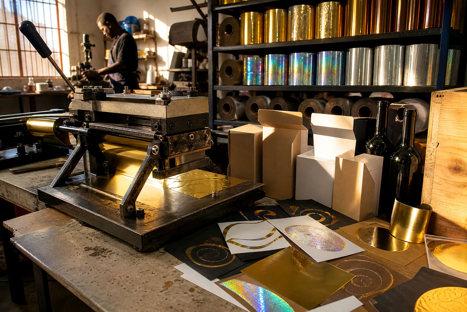
Wine and spirits work often calls for a refined finish, so foil choice needs to match the pack and the press. Metallic gold, silver, copper, bronze, mirror and satin foils are common for neck labels, cartons and wooden boxes where the aim is a crisp brand mark with strong reflectivity or a softer satin look.
Pigment foils in black, white and process colours are useful where the design needs solid opacity, not shine. Holographic and diffraction foils can be used for limited areas, but they must be matched carefully to the artwork so the pattern supports the brand rather than overpowering it.
For packaging that must resist tampering or support authentication, security foils can be specified. Where the application includes leather trims, soft-touch laminate or mixed materials, specialty foils should be checked on the exact substrate before production runs.
- Metallic foils for logos, borders and neck labels
- Pigment foils for flat colour and text
- Holographic and diffraction foils for accents
- Security and specialty foils for extra function
For broader packaging guidance, see Packaging & Boxes and Labels & Stickers.
Check the stock first
Good results on bottles, cartons and wooden presentation packs start with the substrate. Coated board, uncoated board, printed surfaces, varnishes and soft-touch laminate can all change release and adhesion. A quick test on the actual material is always better than assuming the same settings will work across different pack components.
On coated board, foil transfer is usually easier, but overprinting, heavy solids or uneven lamination can affect detail. On soft-touch laminate, the surface can resist release, so the foil, pressure and temperature window need careful testing. Wooden box panels can vary in porosity and surface finish, so make-ready should account for uneven contact.
Ask for swatch books and samples before a run. Press-side advice on temperature windows, dwell, pressure and release profiles helps reduce trial and error, especially when the job has both cartons and labels in one pack set.
| Surface | What to check |
|---|---|
| Coated board | Ink dry-down, coating smoothness and fine detail release |
| Soft-touch laminate | Foil release, pressure balance and edge definition |
| Wood | Surface evenness, grain and contact consistency |
| Label stock | Adhesion and resistance to lift at small detail areas |
Set up the press
Different presses need different handling. Platen, cylinder and roll-to-roll presses each place pressure and dwell in a different way, so the foil and die choice should suit the machine as well as the pack. The aim is even transfer across the image, with no patching, excessive gloss shift or overburn.
Typical starting ranges for test work are usually in the moderate hot stamping zone, but the correct setting depends on the foil type, the substrate and the press speed. Start with controlled make-ready, then adjust heat, pressure and dwell in small steps until the transfer is clean. Always test on the production stock, not a substitute sheet.
Make-ready should keep the image flat and the pressure even. If the pack is uneven or the board has warp, use careful packing and confirm that the die face is meeting the substrate squarely. That matters on neck labels and short-run carton work where a small change shows up quickly.
- Match foil to press type and speed
- Check dwell before increasing pressure
- Use the same stock for testing and production
- Confirm the image area is level and supported
Choose the right die
Die selection affects detail, durability and transfer quality. Magnesium dies are often used for shorter runs and simpler artwork. Copper dies handle finer detail and can suit more demanding work. Brass dies are a good option where the job needs extra wear resistance or repeated use.
For wine and spirits branding, fine serif text, borders and small emblems need a clean die face and sensible line weights. Very thin lines can break up if the stock is rough or the setting is too cool. Large flat areas need even pressure, otherwise the finish can look patchy or show a grainy transfer.
The die should also suit the foil type. Metallic foils usually give the clearest brand impression, while pigment foils can be better when the design must read as a solid mark. For mixed packs, keep the die spec and the foil spec aligned so the carton, neck label and display box have a consistent finish.
For related packaging work, you may also want to review Cosmetics Cartons and Books & Diaries.
Avoid common faults
Most foil faults can be traced to setup, stock or speed. Weak adhesion usually points to an unsuitable temperature window, poor dwell or a surface that is not ready for transfer. Smudging can happen when the foil is not fully released before the sheet moves on. Broken detail often means the die, the substrate or the pressure profile needs attention.
Watch for these common issues:
- Poor adhesion on coated board or laminate that needs a different starting point
- Pinhole or patchy areas where pressure is uneven
- Blurring when dwell is too long or stock shifts
- Loss of detail on small text or fine borders
- Lift at edges where the substrate or make-ready is uneven
If the job includes special finishes, ask for sample testing and press-side guidance before full production. For more on the product range, go to Products, or send your artwork and substrate details through the contact form for advice and a quote request.
What our Hot Stamping Foil customers say
Verified Google reviews
Also worth a look

Ask about a foil for your job
Send a note through our contact form with the substrate, the press you run (platen, cylinder or roll-to-roll), the finish you are after and the run length, and we will come back with a foil grade, a sample and a quote.
Open the contact form