

Matching Pantone with pigment foil
Use these notes to match opaque colour targets with pigment foil on real stock. The focus is proofing, press settings and keeping batches consistent.
When pigment foil is the right choice
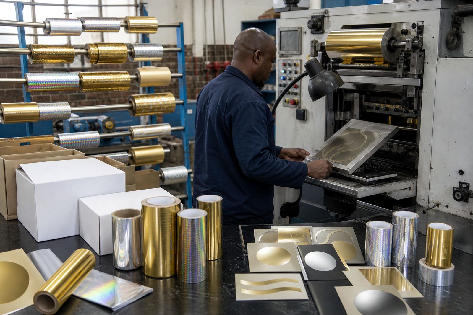
Pigment foil is the normal option when a brand needs an opaque colour, not a metallic shine. It is used on cartons, labels, book covers, leather goods and other printed items where the foil has to read as a solid colour.
For Pantone matching, start by separating what can be matched closely from what needs a visual nearest match. Some colours behave well on coated board and smooth films, while other shades need a small adjustment to avoid looking dull, muddy or too light after transfer.
It helps to keep the discussion practical: substrate, press type, die detail and finish all affect the final look. For more on foil families, see Why Pigment Foil Still Matters and our products.
Set up a useful proof
A good proof starts with the right foil sample, the right stock and a clear target. Ask for swatch books and compare under the same light you will use for approval. A strip on board is more useful than a loose foil sample because it shows release, density and edge quality.
Use a small test area first. For pigment foil, a sensible starting point is usually a moderate temperature window, with dwell and pressure adjusted until the solid area lays down evenly without crushing the image. The exact setting depends on the foil, the stock and the press.
- Check transfer on coated and uncoated board separately
- Note whether the colour looks stronger on heavier coverage areas
- Record the press speed and dwell used for each proof
- Keep the approved sample with the job bag
If the target is on soft-touch laminate, see Foil on soft-touch laminate for more on surface behaviour.
Match colour without chasing it
Pantone matching with pigment foil is usually about control rather than exact ink-style mixing. The foil colour is fixed, so the match comes from choosing the closest stock shade, then controlling transfer so the finished result stays even from edge to edge.
When the shade is just off, do not jump straight to a new foil. First check the release profile, press temperature, dwell, pressure and die condition. A weak release can make the colour look pale, while too much heat can over-darken the impression or sharpen the edges too much.
For a deeper look at setup, read Choosing release profiles and Temperature windows explained.
Keep batch notes tight
Once the colour is approved, the job notes should be specific enough to repeat. Good batch notes reduce guesswork when the work returns, especially on repeat packaging, labels and book cover runs.
| Note | What to record |
|---|---|
| Foil used | Shade, finish and slit width |
| Substrate | Board, film, laminate or leather type |
| Press setup | Platen, cylinder or roll-to-roll |
| Tooling | Magnesium, copper or brass die |
| Run settings | Temperature, dwell, pressure and speed |
For repeat work, also note any make-ready changes, especially where fine detail or solid coverage caused a problem.
Get support on the job
If a colour needs checking against stock, or a press needs a practical starting point, Stampingfoil can help with samples, slit foil rolls and press-side advice. That includes guidance on temperature windows, dwell, pressure, release profiles and die setup for platen, cylinder and roll-to-roll presses.
Use the contact form if you want a quote or need help choosing between metallic, pigment, holographic, security or specialty foil. You can also return to the Journal for related notes on make-ready, shelf life and narrow-web work, or go to Contact to ask for support on a specific job.
What our Hot Stamping Foil customers say
Verified Google reviews
Also worth a look
Ask about a foil for your job
Send a note through our contact form with the substrate, the press you run (platen, cylinder or roll-to-roll), the finish you are after and the run length, and we will come back with a foil grade, a sample and a quote.
Open the contact form