Metallic, pigment, holographic and substrate specialists stocked for South African presses.
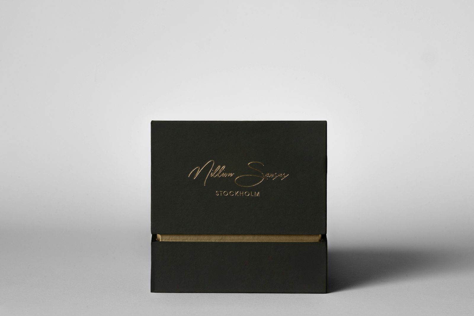
Classic gold metallic for cartons, cards and book covers.
Specs →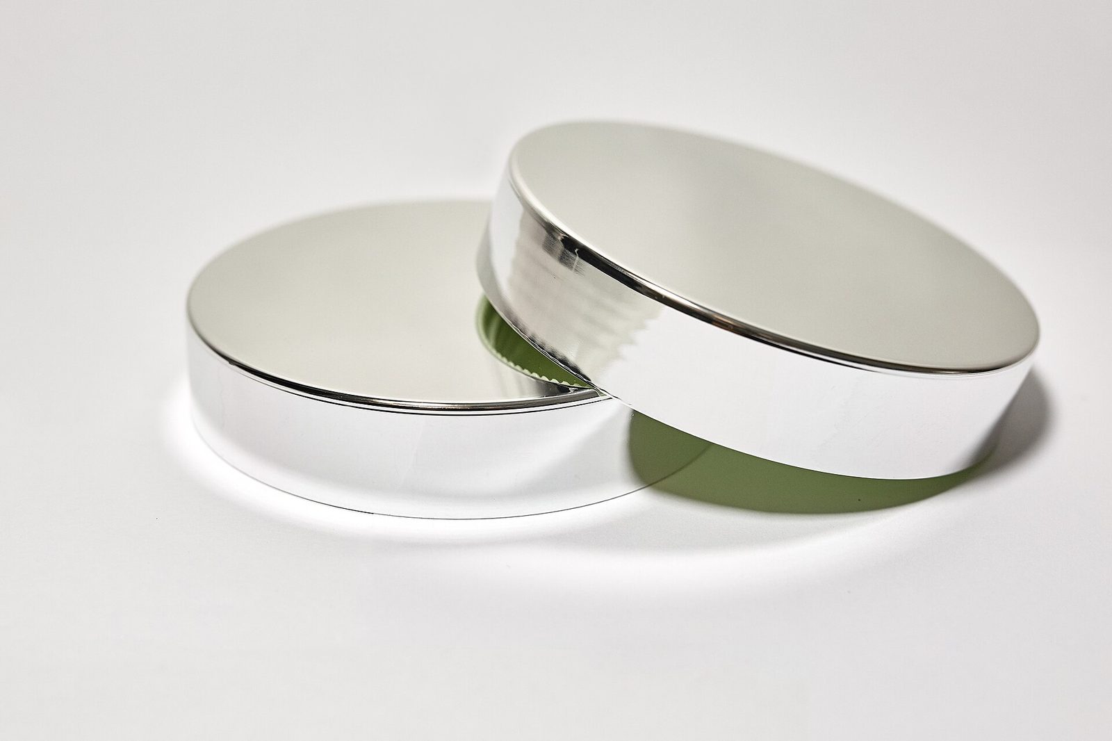
Bright silver for tech packaging and stationery.
Specs →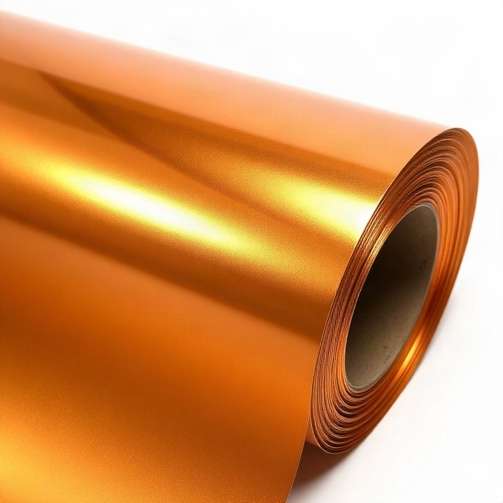
Warm bronze and copper tones for spirits and leather.
Specs →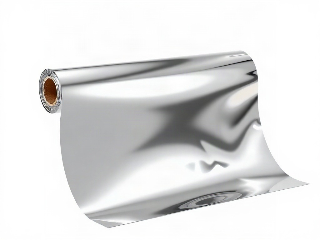
High-reflect chrome effects for cosmetics and electronics.
Specs →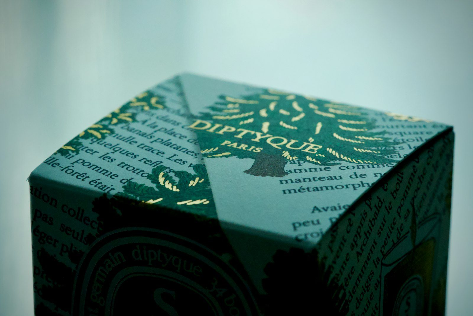
Opaque colour foils that sit clean on dark stocks.
Specs →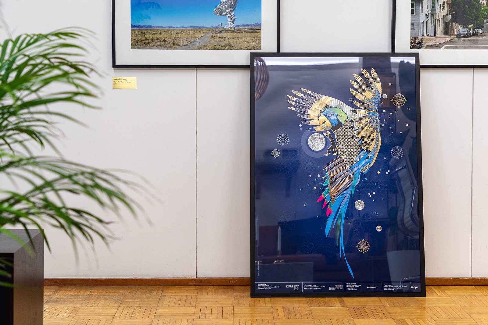
Soft-touch matte pigment for editorial and gift wrap.
Specs →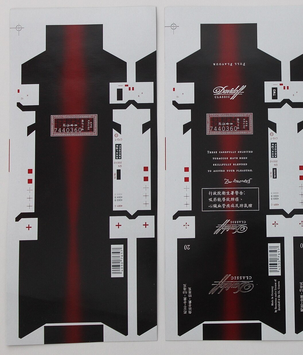
Pantone-matched pigment rolls for brand-critical jobs.
Specs →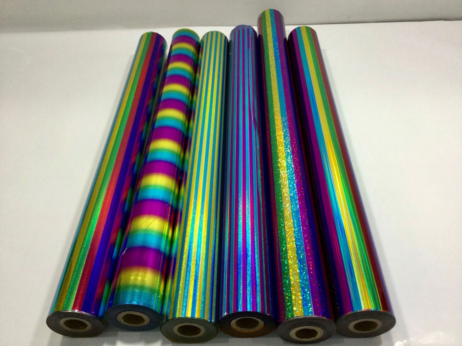
Rainbow holographic for security and youth brands.
Specs →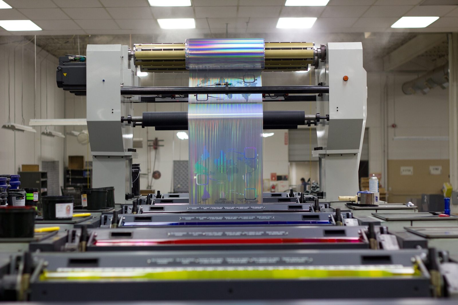
Linear diffraction patterns for labels and seals.
Specs →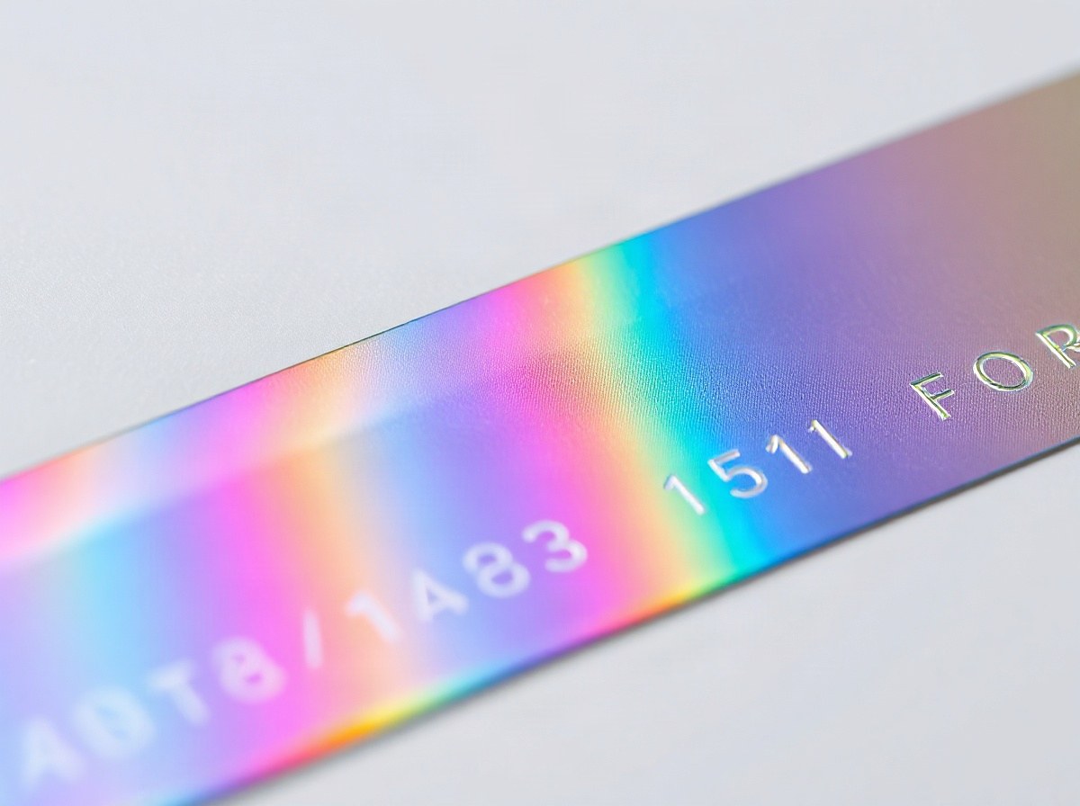
Fine-line and microtext holographic options.
Specs →
Soft-release foils for genuine and PU leather.
Specs →
High-tack foils for PP, PE, PET and ABS.
Specs →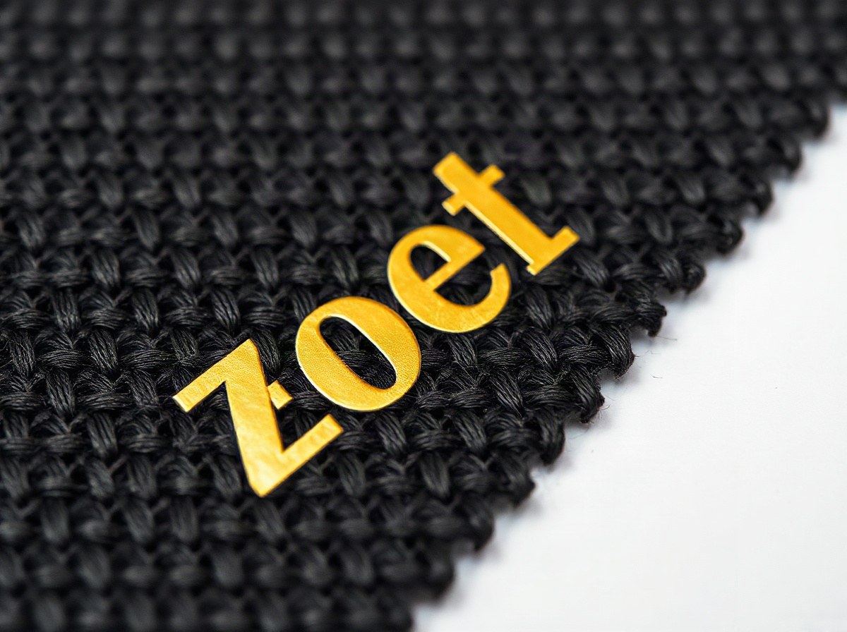
Foils tuned for fabric and apparel branding.
Specs →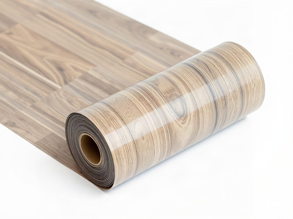
Specialty for wood, acrylic and rigid novelty items.
Specs →Hot stamping foil here is organised by how converters actually buy: metallic staples that sit on the Jet Park shelf, pigment solids for dark boards, holographic and diffraction grades with controlled lots, and substrate specialists for leather, plastics and textiles. The cards above are the catalogue face. This note is how we expect trade partners to use them without guessing.
Start with the look you need on the finished pack, then pick a family. Bright gold for cartons and cards is usually Aurum Gold. Warm antique work on books and kraft leans a different metallic lane. Chrome and mirror effects for cosmetics sit under Chrome Mirror. When the brief only says "gold foil" in a yellow PDF swatch, push back for substrate and press type before you lock a SKU.
Pigment families earn their keep when metallics would muddy a brand colour on black or kraft. Opaque solids, matte velvet and process colours cover seasonal SKUs that must match next year. Inkline Process jobs need a colour conversation early; see colour matching and mail finishes@stampingfoil.co.za with a target chip, not only a Pantone number on a screen.
Holographic and diffraction grades are not interchangeable. Rainbow holo sparkles every way; linear diffraction is directional. Security microtext and registered holograms need batch control and honest lead times, not an open bin of glitter foil. Pair those families with the security printers programme and the security application brief before you promise a tax stamp launch date.
Substrate specialists matter when paper grades fail on leather, PET or cloth. LeatherMark wants softer heat so grain does not crush. PlasticBond needs corona notes on the PO. TextileSheen is its own tack story. Do not borrow a carton grade and hope a Midrand appliance badge or a Durban textile job will behave.
Common metallic and pigment widths stay on the Jet Park pick face so a Gauteng rush does not wait on a slow boat. Odd pitches, matched pigments and security lots indent with batch notes so the next seasonal reprint does not drift. Cape Town, Durban and Pretoria counters keep sample books warm; walk a showroom when the creative team is still arguing bright versus antique.
Each product page carries starting specs, substrate chips and press notes. Treat those as windows, not promises for every ink stack. Soft-touch laminate, UV varnish and dark boards all change release. Keep the press settings sheet near the platen, and ask for a trial roll when the stock is new to your floor.
Ordering is boring on purpose: grade, width, release, batch note, delivery desk. Standing notes for fortnightly reorders keep the pick face honest. Brand owners who foil twice a year get a longer brief and a reminder to re-check soft-touch when the carton mill changes. Mixing both habits on one PO is where Friday nights go wrong.
If you are switching from another foil house, bring a used core or a failed sheet. Seeing the carrier and the laydown tells us more than a brand name on a quotation. We will map an equivalent from the families below or say honestly when we cannot. For programme buying rather than a single SKU, jump to solutions.
Browse finishes when designers speak look-first language, and applications when the question is where the foil lands. Mail foil@stampingfoil.co.za with stock, press type and a phone photo when a make-ready stalls. We would rather talk heat and dwell than send another brochure.
